

Downsview Park
The Story
Canada Lands Company is a self-financing, federal Crown corporation that specializes in real estate, development and attractions management. Borealis was tasked to rebrand their property, Downsview Park, in Toronto. A dynamic urban park spanning 291 acres, Downsview Park offers green-space and mixed-use land that combines education, sports, nature, recreation and cultural events. The brand rejuvenation needed to raise awareness of its extensive activities and program offerings, inform a greater sense of place for Downsview Park, and generate greater pride and engagement across its audiences.
Deliverables
Research & Strategy
Brand Architecture
Identity and Sub-brands
Brand Guidelines
Brand Video
Stationery
Collateral
Advertising
Digital
Environmental Signage

Research & Strategy
Previously completed secondary market research that focussed on audience perceptions and awareness of the Park was examined and supplemented by our own primary research in the form of interviews and discussion groups with key Canada Lands management and staff. The research set the market context and ground work towards defining a new brand strategy and architecture that considered the Park’s current tenant mix and diverse suite of offerings.
Research revealed that Downsview Park’s many vibrant activities were largely unknown by the wider GTA population. The Park’s vision and purpose was equally unclear as was its value as a destination for nature, sports, events, education and more.
Strategic insights and synthesis lead to a new compelling and emotive brand essence that recognized a key target insight — Downsview Park is place of Shared Experiences that brings people together to reconnect in the truest sense; with each other, with nature, and sometimes even just with oneself. This insight then then allowed for a more robust strategy to be articulated which included a renewed brand purpose, brand persona and solidified brand attributes and benefits to articulate in messaging.

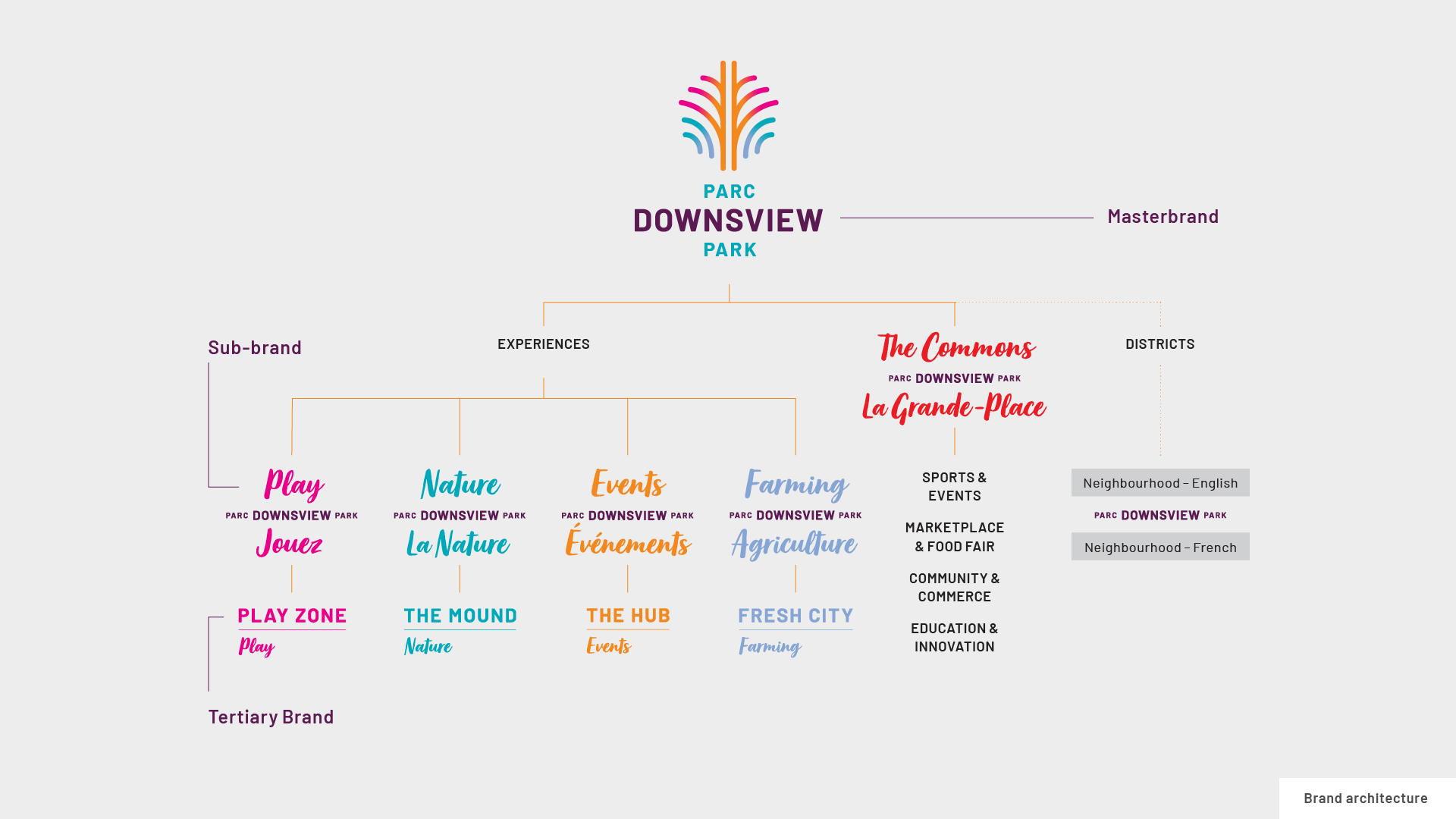
Brand Architecture
To support the Masterbrand and enhance clarity and navigation, the park’s offerings were organized into three main sections and sub-brand lockups were defined as well as tertiary branding to ensure a cohesive brand program is implemented throughout the park’s design materials.

Identity
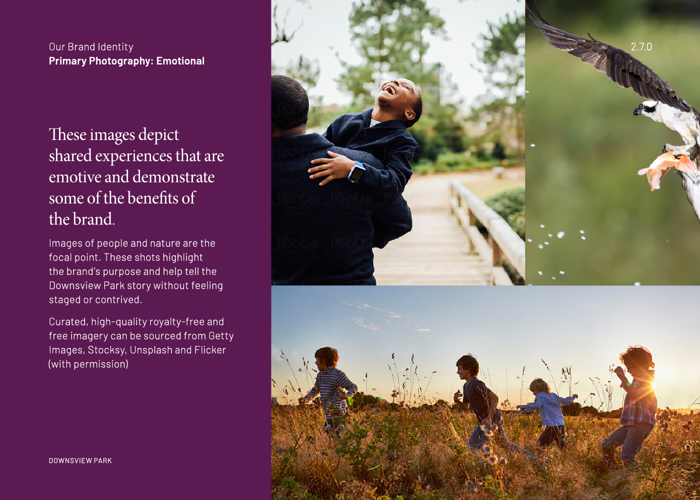
The visual identity represents a spark or spectacular moment shared by all. The connecting lines and pathways, inspired by the branches of trees or winding trails within the park are an invitation to come and explore the park. Inspired by nature itself, the vibrant colour palette reflects tones of cardinals, water, eggplants, sunsets and other bright flora.
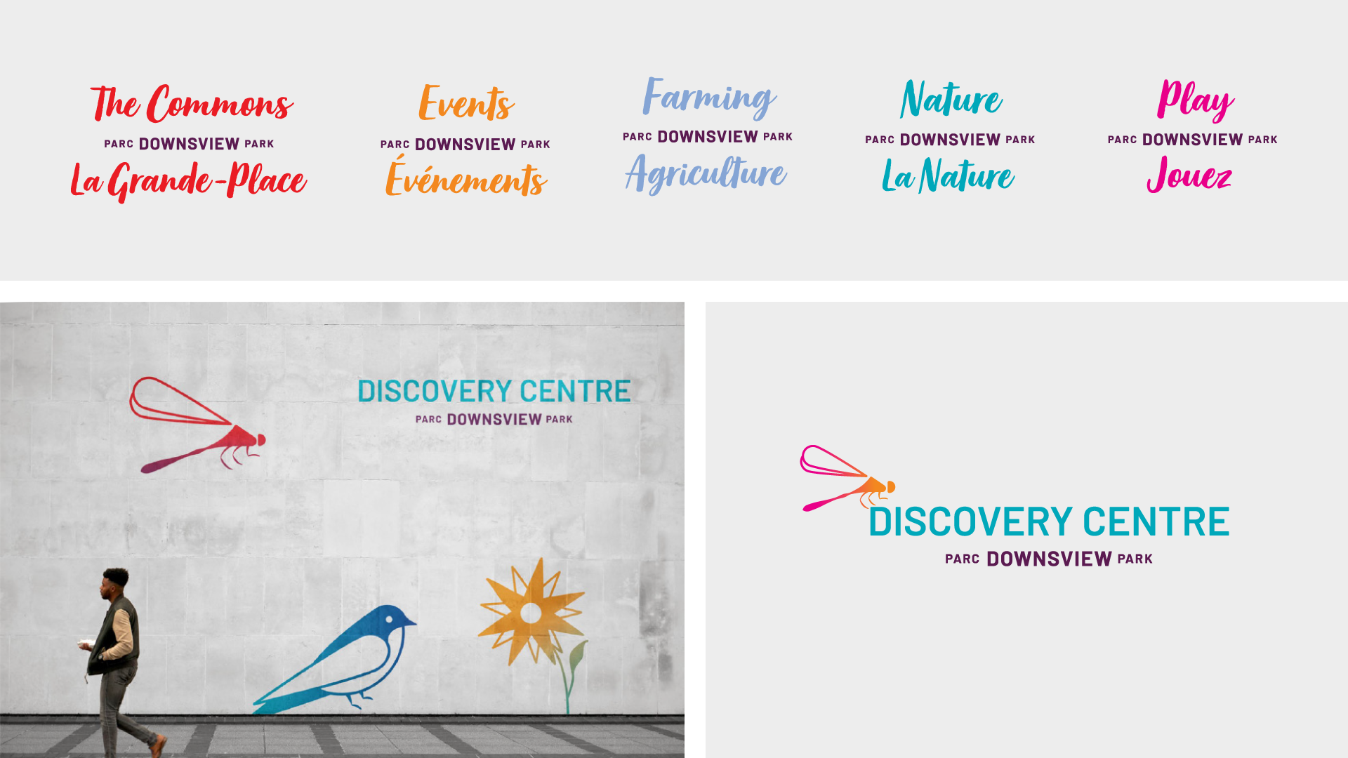
A full suite of bilingual, unilingual, alternate formats, and sub-brands complete the identity and align with the new brand.


Five sub-brand lockups help distinguish activities and experiences throughout the park, and a complementary Discovery Centre logo has been designed with a Damselfly symbol to inspire a sense of curiosity and wonder about our natural world.
Brand Video
A brand video was produced to announce the new identity and highlight Canada Lands continued commitment to the Park’s future. The narrative is consistent with the brand’s persona reinforcing the new brand’s purpose, while reminding and inviting visitors to participate in all the experiences the park has to offer. The video highlights the park as vital urban escape, a place for discovery and reconnection.
Brand Guidelines
The all-new brand is supported by an extensive brand guidelines document.

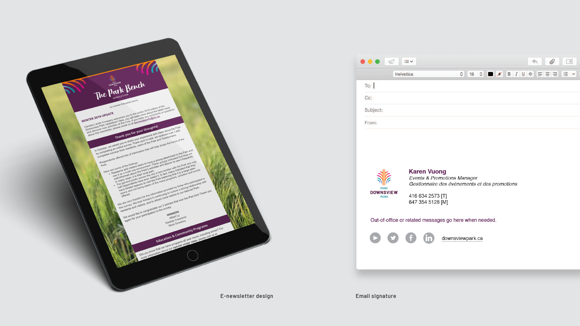
Stationery & Collateral
A full roll-out of materials was developed for every future application: stationery, pocket folder, brochures, e-signatures, merchandise.


Advertising
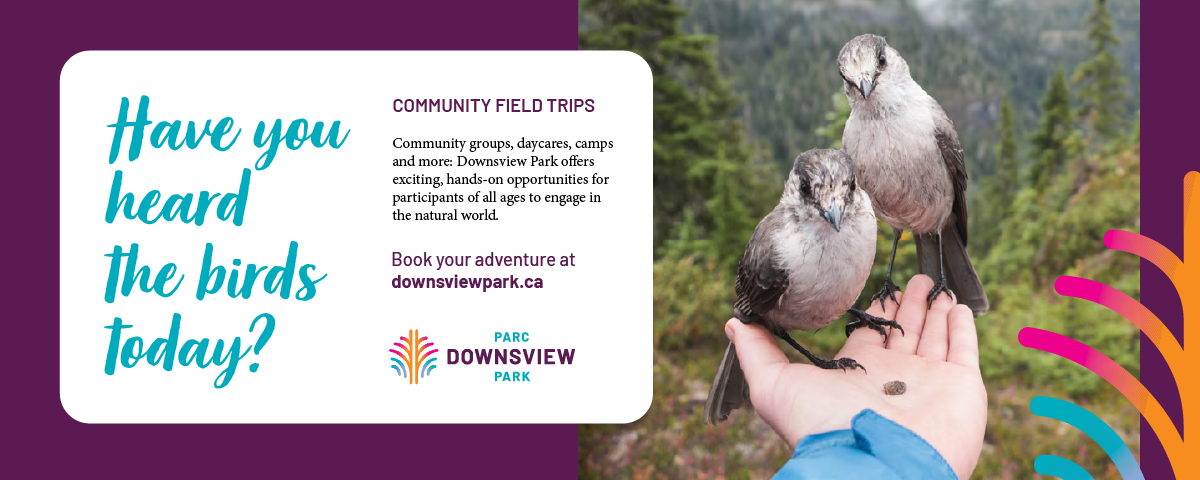
Print and digital advertising conveys the emotional shared experiences in nature and together with friends and family.


Environmental Signage
Park banners, a supergraphic display, hoarding, wayfinding, entrance and visitor signage were all developed as part of the larger branding process.


