

Ontario Tech University
“The university is energized for the future. We have a great story to tell, and we now have the brand to share it — one that is modern, relevant, memorable and will support our position as a leader in technology-focused learning.”
— Richard Seres
Former Executive Director, Communications & Marketing, Ontario Tech University
The Story
Borealis was engaged to help the University of Ontario Institute of Technology overcome a significant branding challenge — their full name was difficult to say and remember, and the acronym UOIT added further confusion. This along with inconsistent brand standards and an undifferentiated brand colour made for an indistinct and unmemorable moniker — a significant problem given the highly competitive post-secondary market. Research confirmed both awareness and reputation were incredibly low as the brand struggled to express their truly differentiated positioning and offering. President and Vice-Chancellor Dr. Steven Murphy strongly encouraged promoting the socially conscious, tech university in a different way, and with his mandate to reposition the University, the need for a bold new visual identity became paramount.
Awards
The work for Ontario Tech University has been highly recognized in the sector, being awarded two of the highest honours available in university marketing: a bronze award from the Council for the Advancement and Support of Education (CASE) for “Best Institutional Brand”, and a Silver Canadian Marketing Award (CMA) for brand building in the “Social Cause” category.
Deliverables
Research & Strategy
Visual Identity Development
Brand Exploration
Brand Guidelines
Research & Strategy
Research conducted by Borealis leading up to the brand identity development process revealed, among other things, that the University’s students were goal-oriented and pragmatic, and valued innovation and leadership thinking. They valued the University for its strong industry-leading programs, and focus on building foundational and flexible skills for the 21st century workplace. The new name, Ontario Tech University, and visual identity concepts, underwent intensive workshops and consultations led by the University to provide a transparent brand development process. The research conducted supported final naming and design decisions eventually producing a winning design that was rolled out across the entire campus.
The Idea
The new identity had to signal the start of an exciting new era and reflect a stronger, emboldened campus spirit. It needed to be seen as a strategic evolution paying homage to the original mark’s core symbology while modernizing it at the same time. More than just a logo, the new identity would become a platform to tell their story with consistency, unity, and ultimately, pride. The highly competitive post-secondary space demanded a new visual identity that was simple, unique and identifiable — one that would enhance Ontario Tech’s image and reputation going forward.

Execution and Tactics
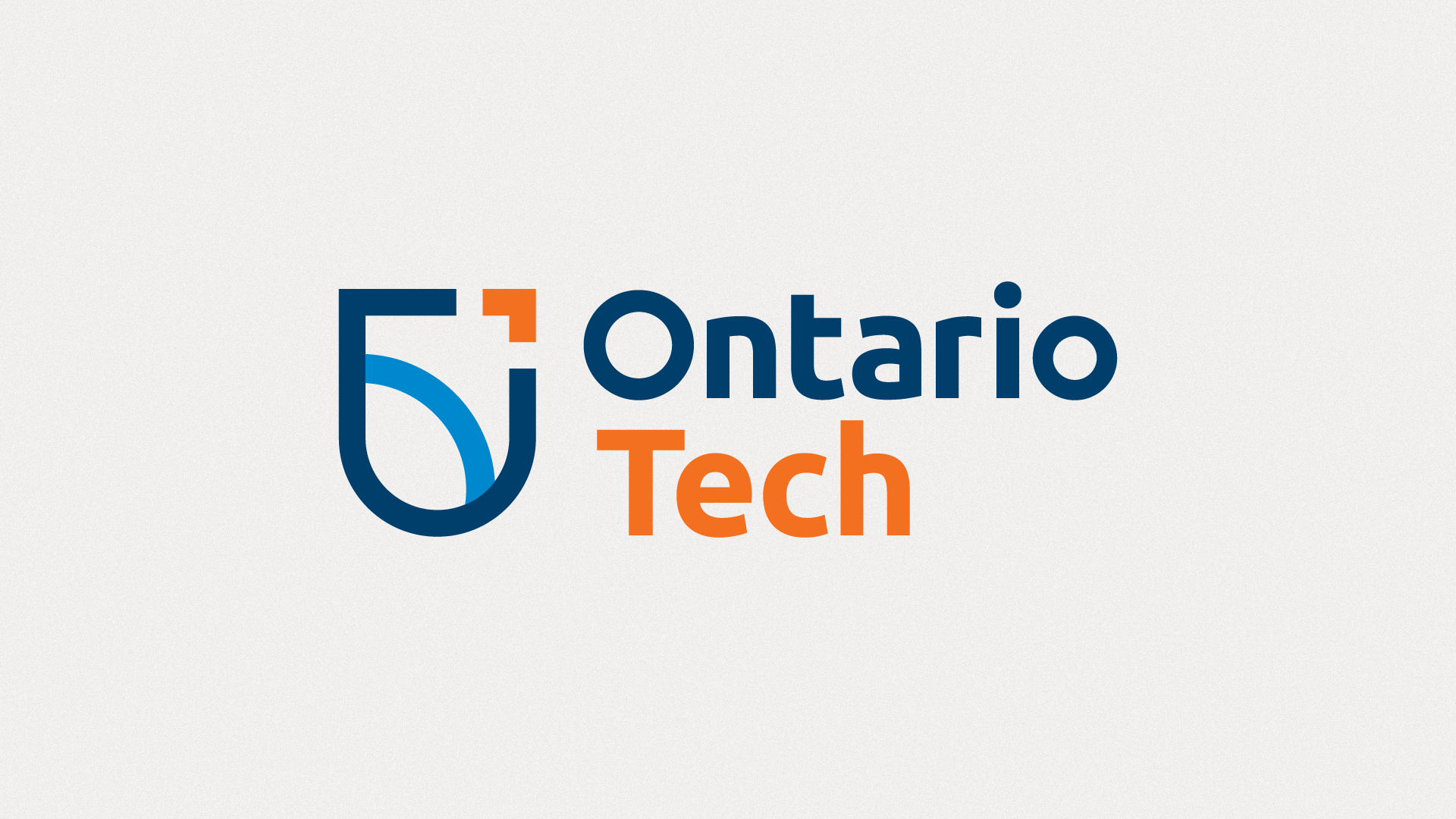
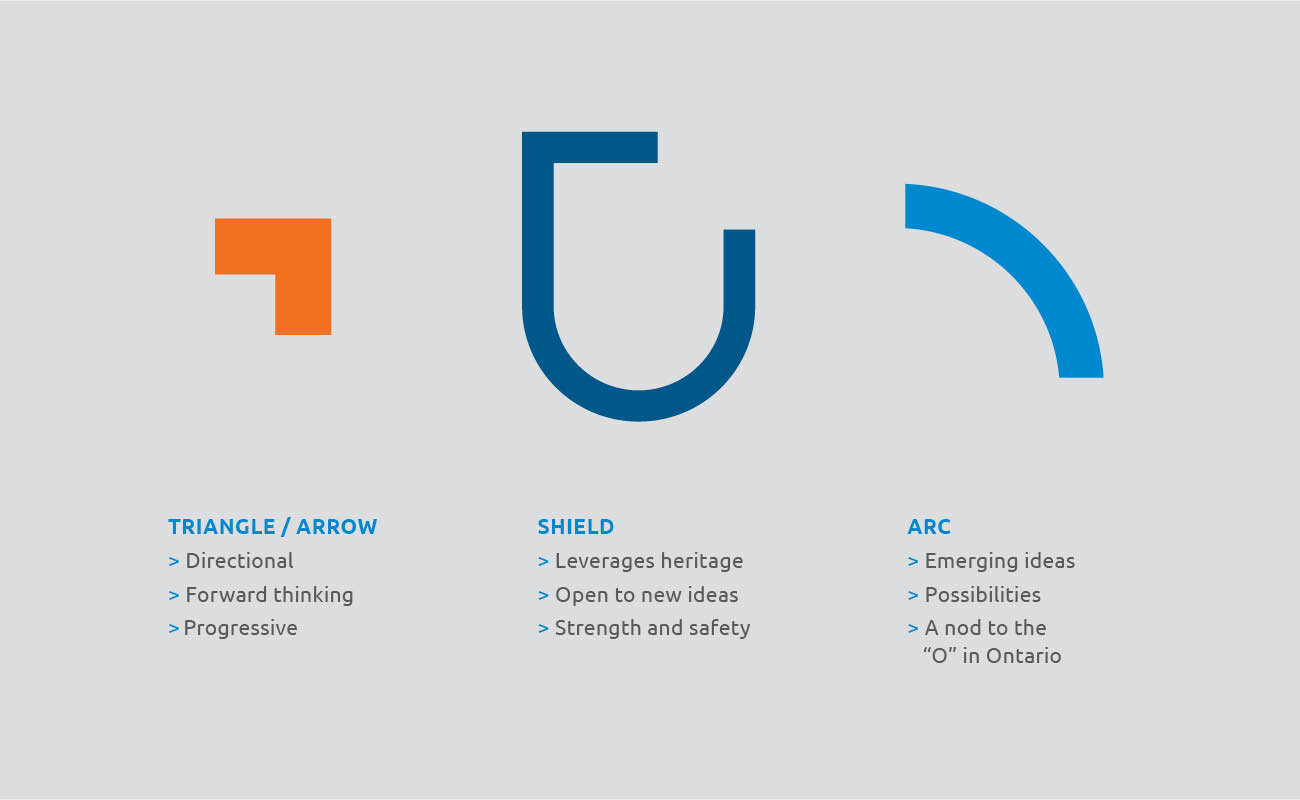
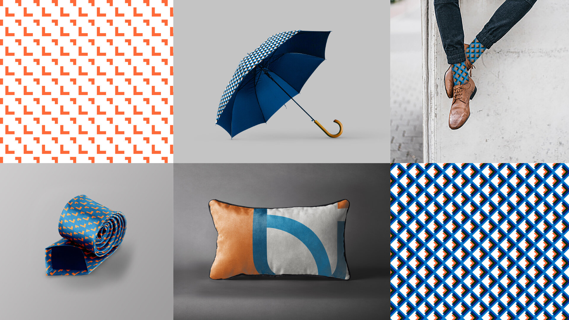
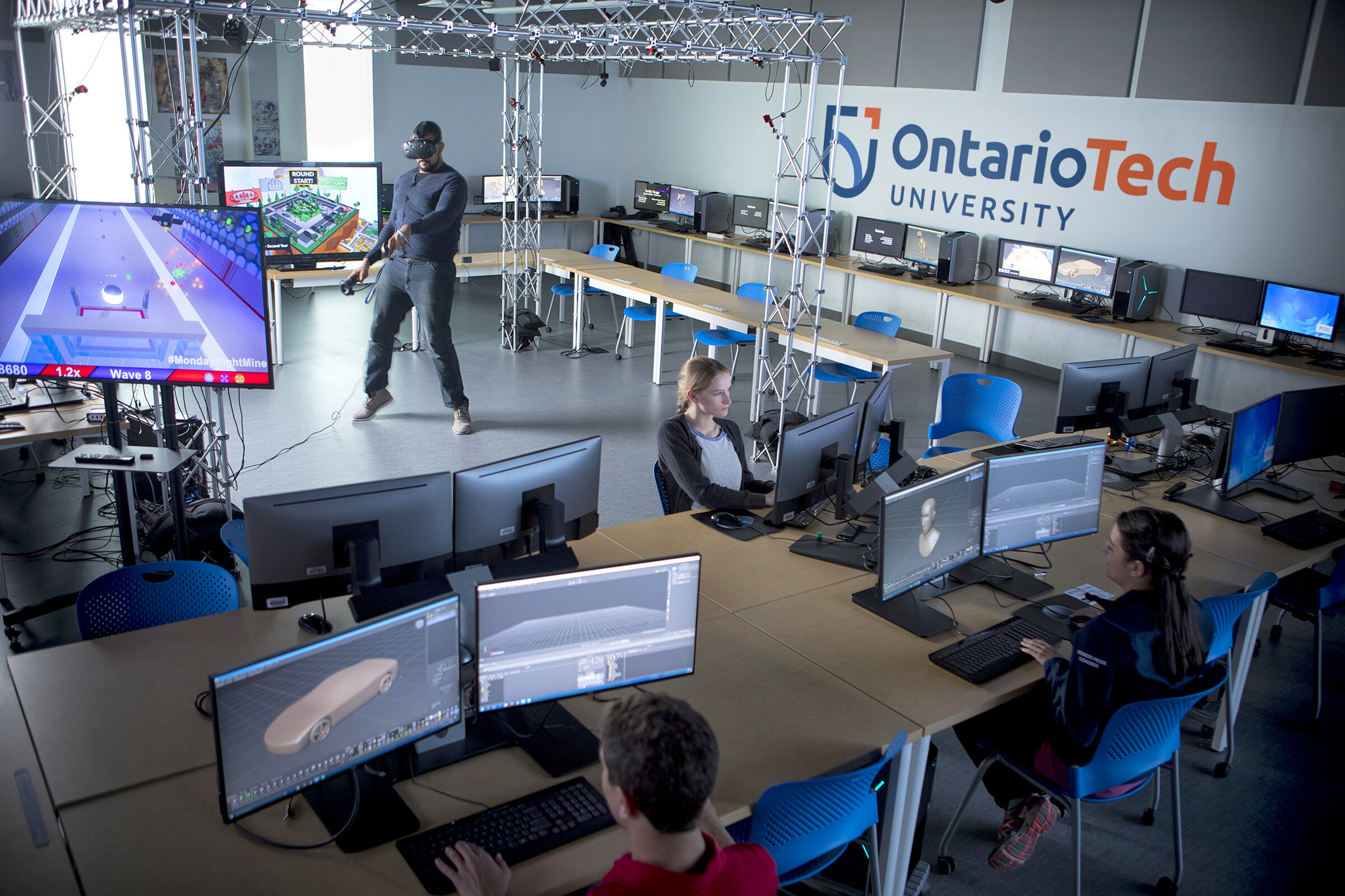
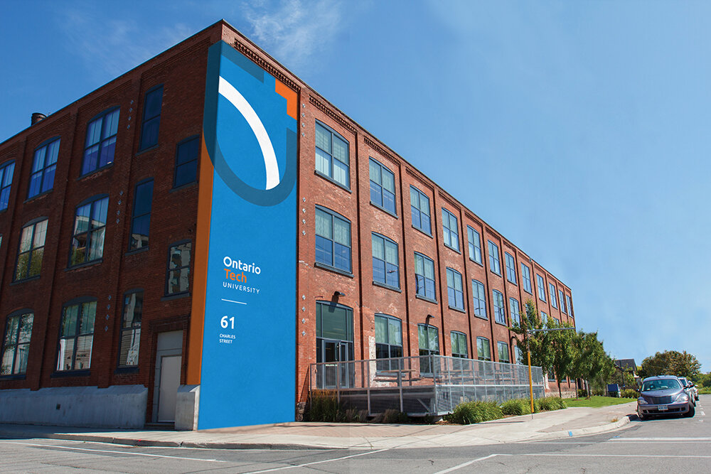
The new visual identity is an evolution of the University's old mark. The iconic shield was simplified and modernized to represent a commitment to openness and possibilities. The triangle was also introduced into their new symbol to reflect tech-forward momentum, always pointing towards a better future. The colour palette was updated with an infusion of orange to differentiate itself against a sea of university blue as well as to bring them in line with the Accessibility for Ontarians with Disabilities Act. A modern, customized wordmark was developed alongside a versatile typography system. A friendly and approachable typeface that supports over 200 – 250 languages was implemented to accommodate all their potential communication needs. The new brand identity has infused every University touch point including merchandise, website, printed collateral, way-finding and building signage, and social media.

Brand Extension
The university’s spirit brand was also updated to complement the new master brand with refreshed “Ridgeback” athletic symbols and word marks. The new Ridgeback Paw is a symbol of power, speed and a mark of excellence amongst its competition while the Ridgeback Dog is reflective of the tenacity and focus of their celebrated athletes. The new spirit branding was rolled out to team uniforms, merchandise, spirit wear and signage.


